Google Maps: Mobile, HTML5, "Desktop" Icons & In the River Promotions.

As Google continues to focus on HTML5 mobile experiences (and do it very well), they have to think about systematically driving usage... which, for mobile, requires 'desktop' real estate. And with core mobile applications, the app store's represent both distribution and the potential of screen real estate (ie icons / launch buttons). Google's strategy of focusing the mobile web experience is a good one... and it's shared by Facebook. But they both know that getting adoption relies on either deep OS integration or getting icons on the home screen.

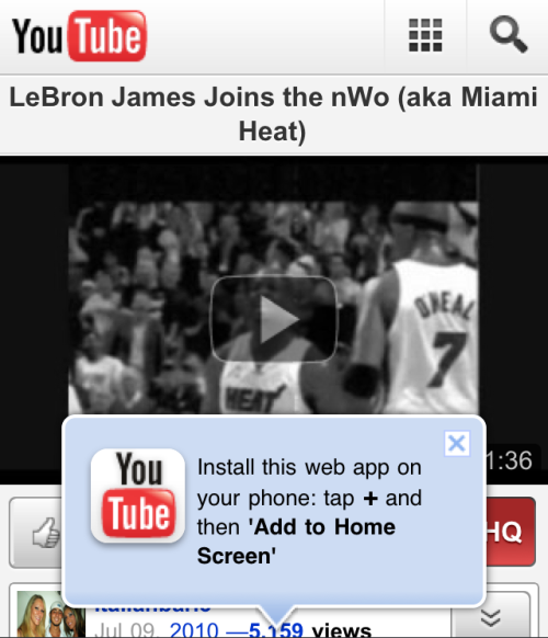
So, when you visit Google Maps and their revamped web product (it too is done very well), they immediately and prominently prompt users to download the 'quick start' icon. Google has used this same tactic with YouTube (example here) - it's smart, effective and easy to integrate.

Yet another powerful example of "in the river" promotion / marketing.

Quora's Elegant Notification 'Panel'

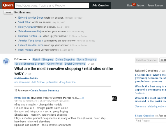
I have written about the design of promotion and notification units several times - pointing at examples from Facebook, YouTube, Twitter, etc. Here is an example from Quora... and while it is similar in its boldness, its very different in its style.

Quora notifies users of updates to questions that they are following. The notifications start on your homescreen and sit above the feed (somewhat similar to Facebook in that sense... but they are expanded by default). When you visit a particular question page, the notifications all sit above the question / answer content.

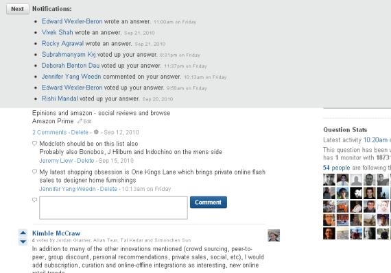
As you scroll down the page, the notifications sit persistently atop the page. It is a design style that is being used more and more... though in different shapes, sizes and formats.

We are seeing more and more persistent units at a page's header and footer. And as pages become busier and busier, persistent 'bars' (for lack of a better term) are good ways of capturing attention. Quora is interesting though because their pages are so clean and simple. But Quora's notification unit is clean and simple itself - and itself an elegant navigational panel and personal newsfeed:

Here are the notifications on the question page:

And here are the notifications sitting atop teh page as you scroll down:

Google Instant Thoughts

After a few days of usage, a handful of thoughts of Google Instant: 1. It's a technical feat: fast, inteliigent, and useful. 2. It's a design feat. Gorgeous, clean, simple and very Google (and Facebook to that extent).

3. It will have a significant impact on SEO and SEM... though I think we are all unclear exactly what it means yet.

My early thought is that it moves power to towards the head rather than the tail. For instance, more value will be placed on head terms and shorter queries - in other words, before the search is refined. For SEM that means that more bidding, traffic and clicks will be driven to those terms... and therefore they will cost more and CPMs will rise.

4. Today it requires you to search from Google.com. For most users, that is fine. But I am not sure that is the way we will behave in the future - and its certainly not I how use Google. My searches all occur in-browser... so Google Instant doesn't apply unless I do a secondary search / refinement.

5. That said, this has significant implications for Google Chrome. Imagine Instant applied to the browser... or to the OS, desktop, etc... Chrome and Chrome OS should utilize Instant across the browser and across other Google properties.

6. I believe this will mark a trend of companies that mimic the UI and design (which I am all for). Over time, this will be a very familiar interface and interaction.

Facebook Places Gorgeous Mobile Promotion

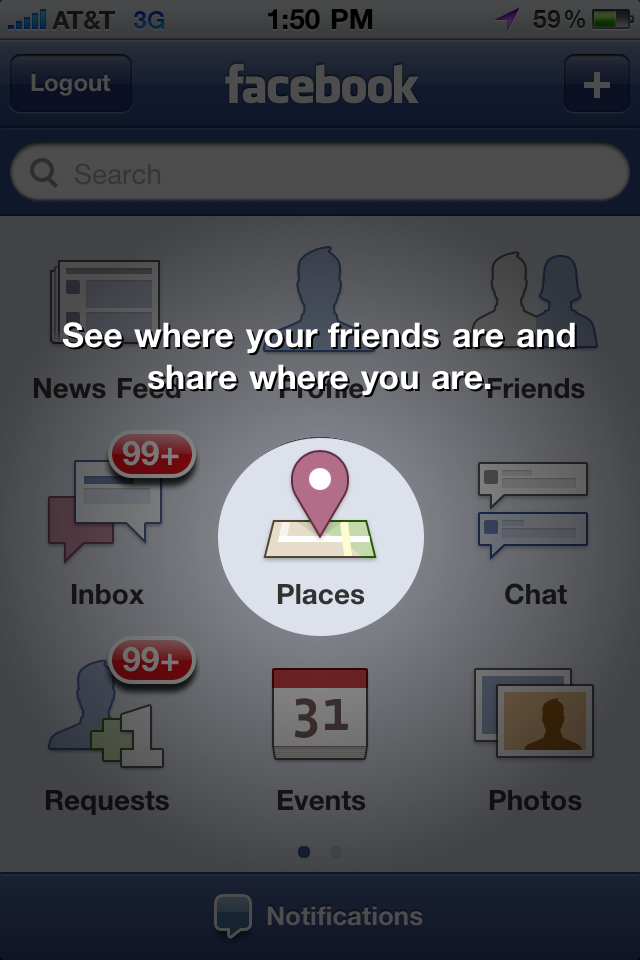
A few weeks ago, I wrote about YouTube's terrific mobile promotion of their new html5 experience. Here is an even better, more eye-catching promotion by Facebook for the new Facebook Places product. As background, to access Places, users had to download the new iPhone app. Upon opening of the new app, the screen animates to highlight the new Places tab and experience. It is great looking but entirely distracting... Which is clearly the intention. I have written before about making sure that new products and enhancements somehow get "into the river" - my reference to ensuring that features are not relegated to the edge of the experience... After all, they then are not core to the experience, rarely used and therefore not impactful. This one way for Facebook to get Places into the river - and considering it's currently a mobile-only product, it is as effective as can be:

Madden 11 Launch Campaign vs. Madden 10

Last year I covered the Madden 10 advertising blitz that took over ESPN and YouTube's homepage with slick, expanding units that interacted with the pages' content. I have always been impressed by ad units that disrupt a page's live content - but ultimately the units are built individually for each site and thus don't scale.... so it's no wonder that the Madden 11 advertising blitz is different: Madden 10 YouTube Takeover

Unsurprisingly, the Madden 11 ad units are quite different. In addition to being contained within their pixel real estate... the big focus is Facebook and social sharing.

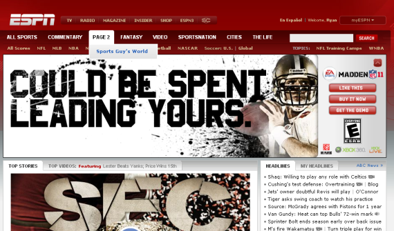
Here is the primary unit on ESPN.com's homepage. The unit itself contracts after several seconds of viewership. Most interestingly, is the order of the ad's three call to action buttons:

1. Like This (on Facebook) 2. Buy it Now 3. Get the Demo

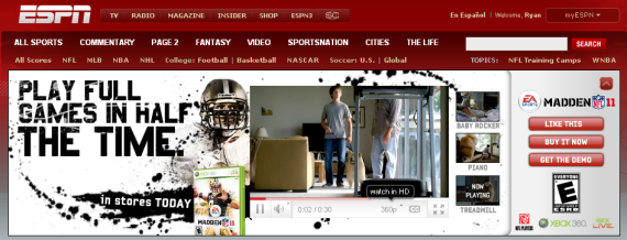
By getting the demo, you are able to view HD video content within the ad unit:

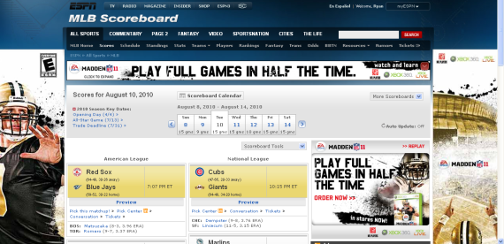
Notice that the Madden 11 campaign extended beyond ESPN's homepage... or even their NFL section. Here is a more aggressive takeover of the MLB Scores section. There is more Madden content above the fold than actual content:

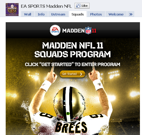
And lastly, when you visit the Madden Facebook page - the focus again is to drive "Likes". Drew Brees points towards the Like button and the 'Get Started' button begins with driving Facebook fans:

YouTube's HTML5 Mobile Site Aims to Drive 'Home Screen' Adoption

Last week YouTube Mobile adopted HTML5... it wasn't long ago that Apple touted YouTube as the iPhone's original launch partner (via a native application). Their adoption of HTML5 is yet another indication that it is fast becoming a standard for web experience and portability. This alone is newsworthy... but I wanted to quickly showcase YouTube's example of their 'pop-up' unit: - it appears immediately on load of a YouTube page - it is big, bold and interferes with the video's viewability... and is therefore noticeable - it directs users to add an icon to their iPhone's homescreen... which is an effective way to convert a pageview to an iPhone icon - it is part of an emerging trend to point directly (both visually and through language) to actionable items

Facebook: 2.8 Billion Visits, 21.9 Visits / Unique in February

January marked the month where Facebook passed Google in visits and Yahoo in Uniques. Today, Compete released their February 2010 numbers and the trends continued:

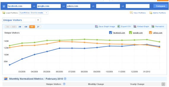
1. Google remains the largest by reach (with 141m uniques) and Facebook has gained some distance ahead of Yahoo. All three sites dipped consistently (4.3-4.9%) from January.

Google: 141.3m uniques Facebook 127.9m uniques Yahoo: 125.4m uniques

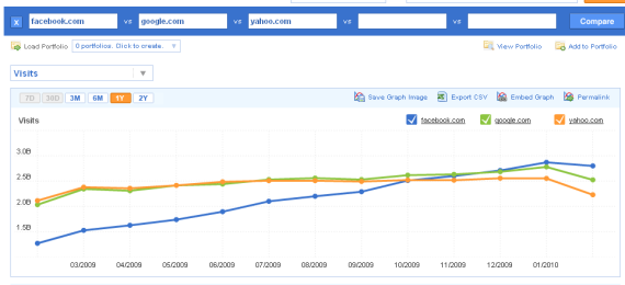
2. Facebook is the largest in terms of visits - really pulling away from Google (2.8b vs. 2.5b). Again,all three sites declined - but while Facebook's decline was 2.5%, Google and Yahoo dipped 9.2 and 12.7% respectively... which is turn created separation between Facebook and the others.

Facebook: 2.8b visits Google: 2.5b visits yahoo: 2.2b visits

3. Google and Yahoo each see 17.8 visits per unique. Facebook sees 21.9... a substantial difference.

4. It is also interesting that Google's top "referral" and "destination" site was Facebook (Yahoo was #2 and YouTube #3).

Facebook Widgets Play Video

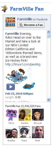
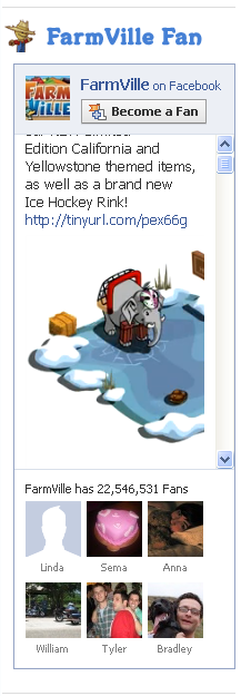
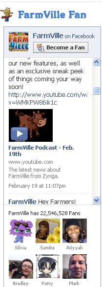
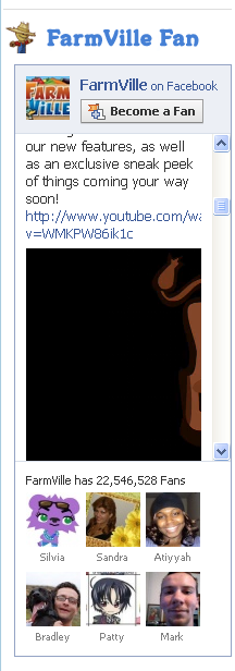
As seen in the below screenshots, Facebook Widgets now feature and play video in-line (although I am not entirely sure that this is a new release - it is my first exposure to it). These are examples from Zynga's Farmville.com - which features a Farmville Fan Widget. The widget has:

- logo - become a fan button - Farmville's feed - Farmville's fans (22.5m!) Notice that the latest newsfeed post has a video play button. Here are two examples, both of which play the video in-line: Facebook Video and YouTube. You will notice that it is still a little funky as the videos are not sized corrrectly for the widget's widget / height. Nevertheless, it makes the widget far more interactive:

Facebook Video: Example

YouTube Video: Example

New YouTube / Google AdSense Unit?

I cannot tell if these are:- new YouTube ad-units, or - bizarre / sneaky advertiser units

... but they are appearing more and more across the Google AdSense network. The below screenshots are taken directly from advertisements appearing on my blog:

1. This is what a standard YouTube unit looks like: big play button in the upper right corner and the standard YouTube footer beneath (play, sound, progress bar and "Ads By Google logo").

2. This is an example of a different "YouTube" unit... whether official or not: an image, a smaller Play button that prominently displays "YouTube.com" and text that looks like a text AdSense unit.

3. The unit is fishy for three reasons: A. When clicking "play", it goes to the YouTube URL rather than playing in-line, and B. The unit's size is slightly off - if you highlight through the text, you notice that it scrolls within the unit (see the difference between these two screenshots) C. Google is very particular about showing the "Ads by Google" graphic... which is hidden unless you scroll down

Here are two more examples... suggesting that it is in fact a new unit: