Hulu's New Social Sharing Gives Visual Control

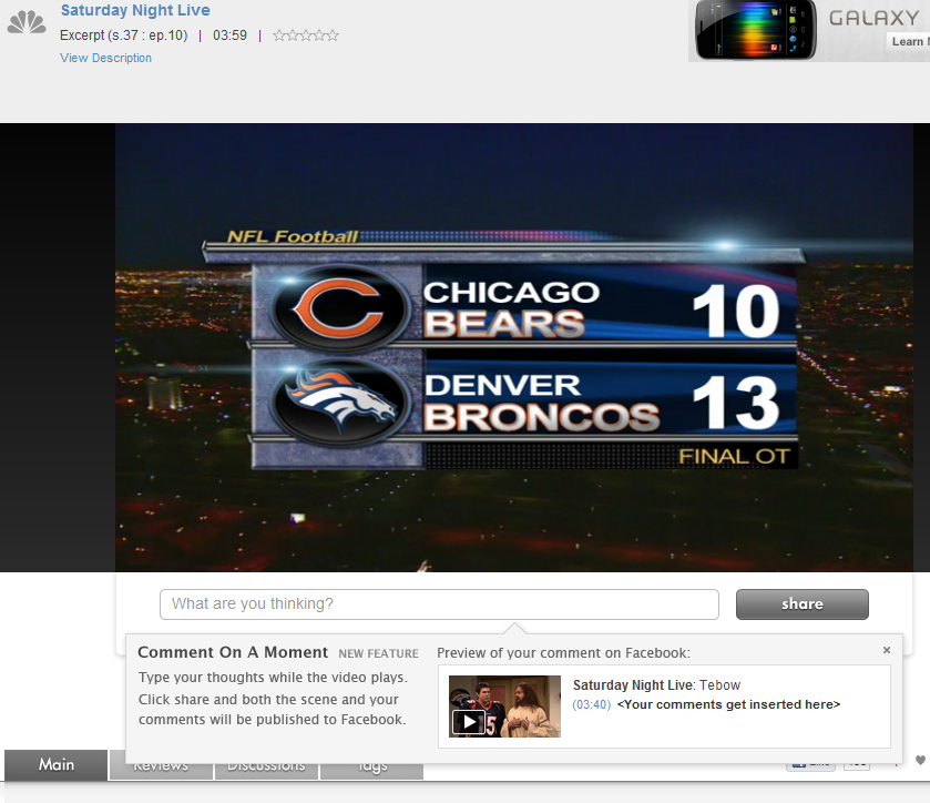
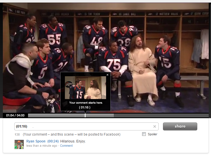
Hulu has introduced a new sharing mechanism that does two things: 1. It allows users to comment specifically on 'moments'. That then publishes the specific scene to your Facebook wall and stores your comment at the specific moment within the timeline. At scale that creates a very interesting concept: a dialogue that moves along the video's entire timeline. At scale that also poses a problem: will I want to read all of that content? Not sure... but interesting.

2. The preview UI is terrific. This is what first caught my eye: the pop-up box showcases the specific screenshot, comment and formatting that will appear on Facebook. That's really good-looking, unique and powerful.

Why is it potentially powerful: first, because I think users like to feel control over what is published and this is a visually, fully controlled experience. Second, it is different... and that means that users will drawn to it (as compared to a standard like button).

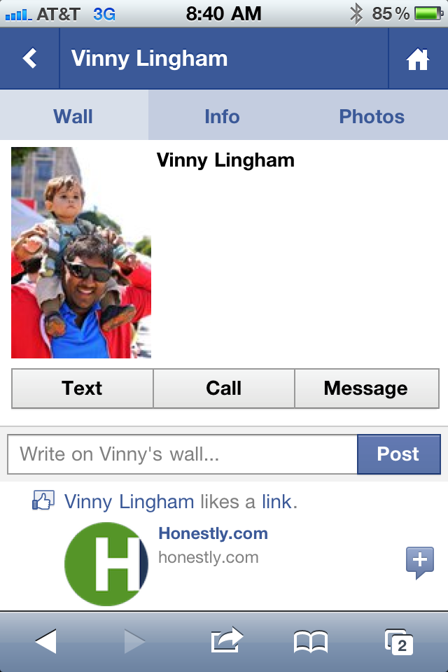
I really like this experience and don't see why it can't be applied to other visual mediums like e-commerce.

Google Currents: A Reminder about Mobile UI

Below are three screenshots from Google Currents on the iPhone (Google's Flipboard-like product). Rather than commenting specifically on the Currents product, I wanted to share three themes I was reminded of when first using the app: 1. Mobile UI is really critical and really unique. (you've heard this before and will again & again).

2. Mobile UI is very different on iPhone vs. iPad. Different real estate and different behaviors / expectations. The below examples demonstrate why this experience just does not work on iPhone. You have to treat them differently and create unique experiences specifically tailored for each.

3A. The genius of Flipboard is not the content. That's become more of a commodity: publishers of course want their content in as many places as possible. It is the UI and the interaction. It is the magic users feel when opening, using and sharing.

3B. And it's that magic that you need to capture within your product(s) and experience(s) - of course in your own, relevant way.

Fitness 2.0 as Demonstrated by P90X's New iPhone App.

By now you have surely heard of P90x - the ultra-popular home workout program that become famous for the never-ending infomercials. After the success of P90x, parent company Beachbody recently released P90x 2... and in conjunction with the launch, they released an iPhone application. It's interesting for a few reasons: 1. Fitness 2.0. It's at the intersection of an evolving, important and fast-moving space: fitness 2.0 (for lack of a better description). What's that mean? Applying the new web to fitness: social, gamification, mobile, etc. Note: if you're working on something in this space, I'd love to hear from you. Contact me

2. Gamification & Social Hooks: notice that this app does more than just award badges. It is part of Apple's Game Center.

3. Paid & Premium. You would think that they would package this application for free as a way to drive awareness / purchases of the workout system. Nope. I guess they don't need awareness. SO they are selling it for $4.99 and include in-app purchases that are relatively expensive (videos & clips).

4. High Ratings. Achieving high ratings in iTunes is an impossible task. 4.5 stars out of 83 reviews... for a paid app? That's impressive.

Don't Stop at Onboarding New Users. Example from Foursquare.

I rarely visit Foursquare.com (it's one of those destinations that is almost entirely mobile). Nevertheless, Foursquare is doing very interesting stuff on its .com and is clearly focused on using the web to build out deeper content, directories, etc. So I visited Foursquare.com and this was the above-the-fold module I was first presented with. There isn't much ground-breaking - or even truly unique - about it. But it is highly relevant to a theme I have been thinking & talking a lot about recently: active user experience and optimization.

What does this awkward string mean? In short: so much attention is paid to new user experience (registration, conversion, onboarding, etc) that current users are somewhat neglected. Of course active users are not neglected from the a product experience - but the same care with which newbies are onboarded should be given to active users. Conversions don't stop after the registration flow:

- vistor >> - new user >> - active user >> - highly engaged user >> - super user (top 1%)

Back to the seemingly ordinary screenshot I included. It prompted this post because of the care that is given to driving deeper engagement and networking:

1. Tailored for the destination First, Foursquare understands that the act of networking is more efficient / powerful on the web than on mobile

2. Drive to a specific action They also realize that the more friends the better: notifications, engagement, virality, etc

3. Lots of opportunity And that I have 889 Facebook friends on Foursquare (wow) - yet am only connected with a handful of them

4. High converting design So they present this to me boldly, using the Facebook Facepile and a big, bright green Find Friends button.

Again, this is a minor example - but it speaks to the care with which Foursquare is thinking about driving activity as much as they are about new user onboarding.

Three Reasons a Facebook Phone Can Work.

This week we learned of Facebook's internal project (code-named Buffy) to build a Facebook Phone. Much of the tech press laughed: it's too late! It's too crowded! Facebook isn't a hardware company! And so on. Let's not assume failure for three reasons.

1. As I have written before, Facebook a better understanding of what I believe to be a phone's most powerful lever: identity and your contact list.

For most people (which may well be outside silicon valley). Imagine walking into Best Buy, purchasing the phone and walking out with a directory of people, contacts, phone numbers, emails, updates, etc.... simply by logging into your phone. That's really, really powerful. A stub of that already exists through their app and it's a function I use all the time when seeking phone numbers:

2. Core apps are already popular and/or easily buildable. Facebook's Messanger app is currently #2 in iTunes (think SMS). Facebook is #5 (and the experience would be tremendously better if natively integrated). Other popular functions can all be at the app level: - photos: sharing, filters, etc - contacts: really, really powerful - email: messages + hooks to Gmail, Outlook? - music: app ecosystem will support through Spotify, Turntable, Rdio, etc - calendar & events: hooks into Facebook events + opportunity to build out calendaring tools - games...

3. Pricing. Remember why Android took market share so rapidly: pricing pushed towards zero, undercut Apple and allowed them to reach a wider audience.... an audience who is probably more attracted to and a better fit for a Facebook Phone.

NBA.com Demonstrates Common Oversight of Mobile E-Commerce / Promotion

If you read me regularly, you know that I have a major pet peeve around unoptimized (and often dysfunctional) mobile experiences. So often mobile is treated an extension of the web experience and that results in broken mobile experiences... and since so much of our content consumption is on mobile devices, the lack of attention to the mobile experience is both frustrating and foolish. Great example here from the NBA (who I have had lots of social advice for!):

The NBA has 3,000,000+ Twitter followers.

40% of Twitter's users access the service via mobile (not the web).

The NBA tweets a link to the newest pair of Nike Air Jordan 8.0 shoes:

Great promotion right? When you click on the link, the NBA Store automatically redirects all mobile traffic to a defaulted storefront / homepage. And thus the frustration: 40% of those who clicked the URL, with the hope of arriving on a specific piece of content, had to give up and exit.

Also funny, when you go the URL from your browser, you get another frustrating experience: a totally untargetted promotion (hello Canadian users!):

Introducing Mixel

A Dogpatch Labs NYC and Polaris-backed startup, Mixel launched this morning. Using the iPad - Mixel lets you make, share and remix collages in a whole new way. You can download it in the app store here. Founded by former New York Times digital design director Khoi Vinh and Scott Ostler (dump.fm), Mixel is the first social art app for the iPad. With the free app, anyone can create and share fun digital collages, called mixels, using images from the web, Mixel’s library, or their own personal photos. Any image in Mixel can be quickly cropped, rotated, scaled or combined with other images using the simple, intuitive touch gestures familiar to iPad owners.

This excerpt from Sam Grobart's NYTimes piece ("Mixel Makes Art Social") does a great job conveying why I am excited about Mixel and the creative output that will pour from it: I watch my 1 year old son interact with the iPad the magic & delight that comes from it - Mixel has the opportunity to bring that same creativity and magic to adults who, like me, might not necessarily be artistic. That's powerful and fun:

"I tried Mixel, and it was fun and intriguing. I cannot draw to save my life, but collages? That I can do. You feel like you’re playing Art Director: Fisher-Price version. I mean that as a compliment — it’s fun to juxtapose images and text, and it’s worlds easier than, say, painting. That would’ve been enough to make a perfectly nice app, but adding the social features, where friends and others can create chains of meme-like images, turns Mixel into something more deeply compelling. It’s a conversation I’m looking forward to having."

You can read more here: - TechCrunch - NY Times - All Things D - VentureBeat - GigaOM

Introducing Mixel for iPad from Mixel App on Vimeo.

Amazon's Kindle Lending Club Makes the Already-Affordable Kindle Fire Even More Attractive

In the last month alone, I have purchased three books on the Amazon Kindle store (I use the Kindle app on the iPad)... had Amazon's new Kindle Lending Library program been live, I would have simply purchased the Kindle Fire and considered it an eventual cost-saving: - I've spent $40+ on books over the last month alone - The device itself is $199, now comes with effectively free books... and a gadget with much more

No brainer right? (big caveat: assuming content library is strong - it certainly appears to be)

And that's why Amazon is brilliant: - They changed the tablet landscape through pricing. - They used it, along with other launches, to drive Prime membership and usage. - They are now introducing a new way to deliver / consume books ... which has already happened to music (hello: Turntable.fm, Spotify, Pandora) - And yet again users have to ask if the Apple & iTunes & iBooks experience is worth paying more for than Amazon's (Kindle Fire, Kindle Store, ec)