Flipboard: In the River Promotion, From iPad to iPhone?

I write a lot about targeted marketing - which means effecting messaging your users at the right moment and in the right place. I use the term "in the river marketing" to describe it. Here is a great example by Flipboard - a master at mobile design. Flipboard - which has huge distribution as an iPad app - is trying to promote their new iPhone app (which generally is a different experience and design). To do that, Flipboard gets as "in the river" as possible. The welcome screen generally displays a story from your network. In this case, it is a note directly from Flipboard's CEO Mike McCue and describes their new iPhone app. This ensures that all Flipboard users see the message and, at the very least, recognize that Flipboard now exists for iPhone. That's aggressive. But it's targeted: these are Flipboard users and iPad owners (so they likely have iPhones as well).

The major question that mobile publishers / developers struggle with: how do you then drive conversion? What next after this message? Driving downloads across device is difficult. Driving downloads from the web is even harder. Then layer on tracking to understand the efficacy of the campaign and it's unfortunately very difficult...

Google Currents: A Reminder about Mobile UI

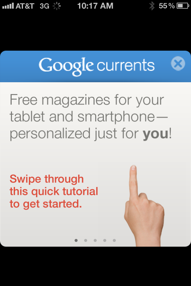
Below are three screenshots from Google Currents on the iPhone (Google's Flipboard-like product). Rather than commenting specifically on the Currents product, I wanted to share three themes I was reminded of when first using the app: 1. Mobile UI is really critical and really unique. (you've heard this before and will again & again).

2. Mobile UI is very different on iPhone vs. iPad. Different real estate and different behaviors / expectations. The below examples demonstrate why this experience just does not work on iPhone. You have to treat them differently and create unique experiences specifically tailored for each.

3A. The genius of Flipboard is not the content. That's become more of a commodity: publishers of course want their content in as many places as possible. It is the UI and the interaction. It is the magic users feel when opening, using and sharing.

3B. And it's that magic that you need to capture within your product(s) and experience(s) - of course in your own, relevant way.

Flipboard: The Best Way to Read Hacker News

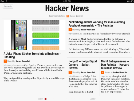
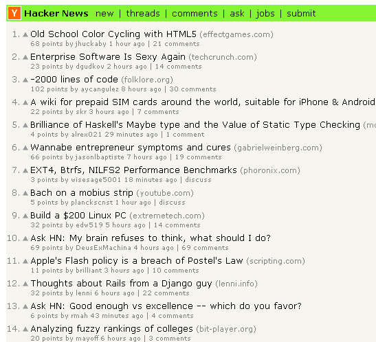
A reminder from the uber-popular Flipboard iPad App: design and UE/UI can alter an entire experience. Using Flipboard, you can read Hacker News as a magazine... and its beautiful, fun and social. It is the same content, just presented in a very different way. And just as it's a reminder - it is inspiration to (re)consider product design. Hacker News via Flipboard iPad app:

Hacker News via web:

.