Amazon's MyHabit Launches with "Exclusive Membership" Gimmick. Except for Amazon Users (eg everyone).

Remember when Gilt Group and Rue La La first launched and you had to be "invited"? It was a genius marketing effort that established a brand of high-end exclusivity. It also was important in jump-starting the early viral channels (referrals and rewards). Of course, if you didn't know a registered user, you could "request membership" and, within a day or two, your invite would arrive. It was great positioning and marketing. This week Amazon entered the flash sale space with MyHabit. It is very much like Gilt and Rue La La, etc (and, for what it's worth, is very much unlike how I think they should play in the space).

To position themselves as Gilt and Rue did at launch, they too ask users to register and "request membership". The word "request" obviously suggests membership is selective and not instant (despite the headline "become a member instantly"). There is your exclusive, premium positioning.

But that is entirely pointless because anyone with an Amazon account already has an account: "hint: if you already have an Amazon.com account, you may use that to sign in." And of course anyone visiting MyHabit has an Amazon account.

This makes the marketing / positioning effort insincere and beyond gimmicky (since its an extension of a proven gimmick). Just put a big sign-on button and optimize the hell out of it. Then focus on the products and the experience. That's worked for Groupon and LivingSocial. And with Amazon's brand and massive audience, it's the better way to launch / play.

Redbox's Smart Movie Promotion Aims to Validate Emails.

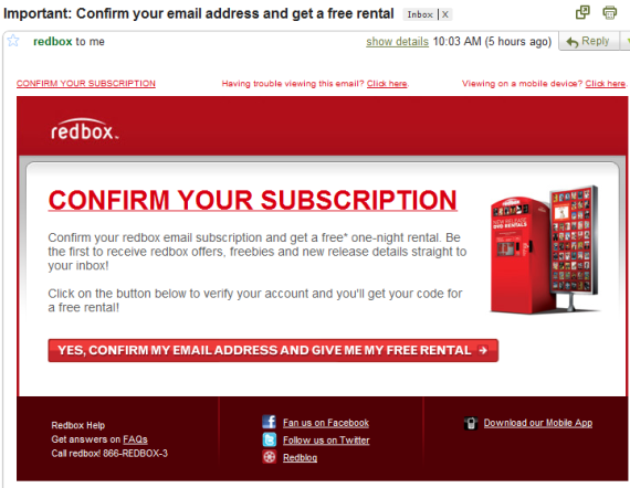
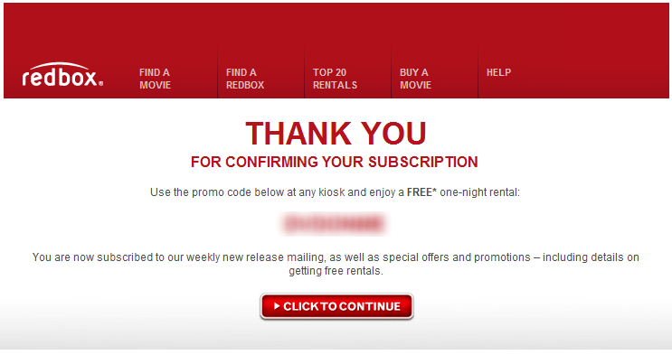
Redbox is a service I love, a product that is terrificly done and a business whose future is murky (negative: moving digital and Netflix as a competitor; positive: Netflix as an example of transitioning perfectly). One of underrated components of Redbox is their email interaction with customers... and in some ways, they are similar to Groupon, LivingSocial, Gilt Group and Rue La La: email marketing drives the business. So it wasn't surprising to me that, after my first Redbox rental, they followed up via email with the following promotion: confirm your email address and receive a free rental (DVD or Blu Ray). They understand the value of a verified, engaged email user... and they are willing to give free product away (they also make some direct revenue on the promotion because of rental 'late' fees). Smart.

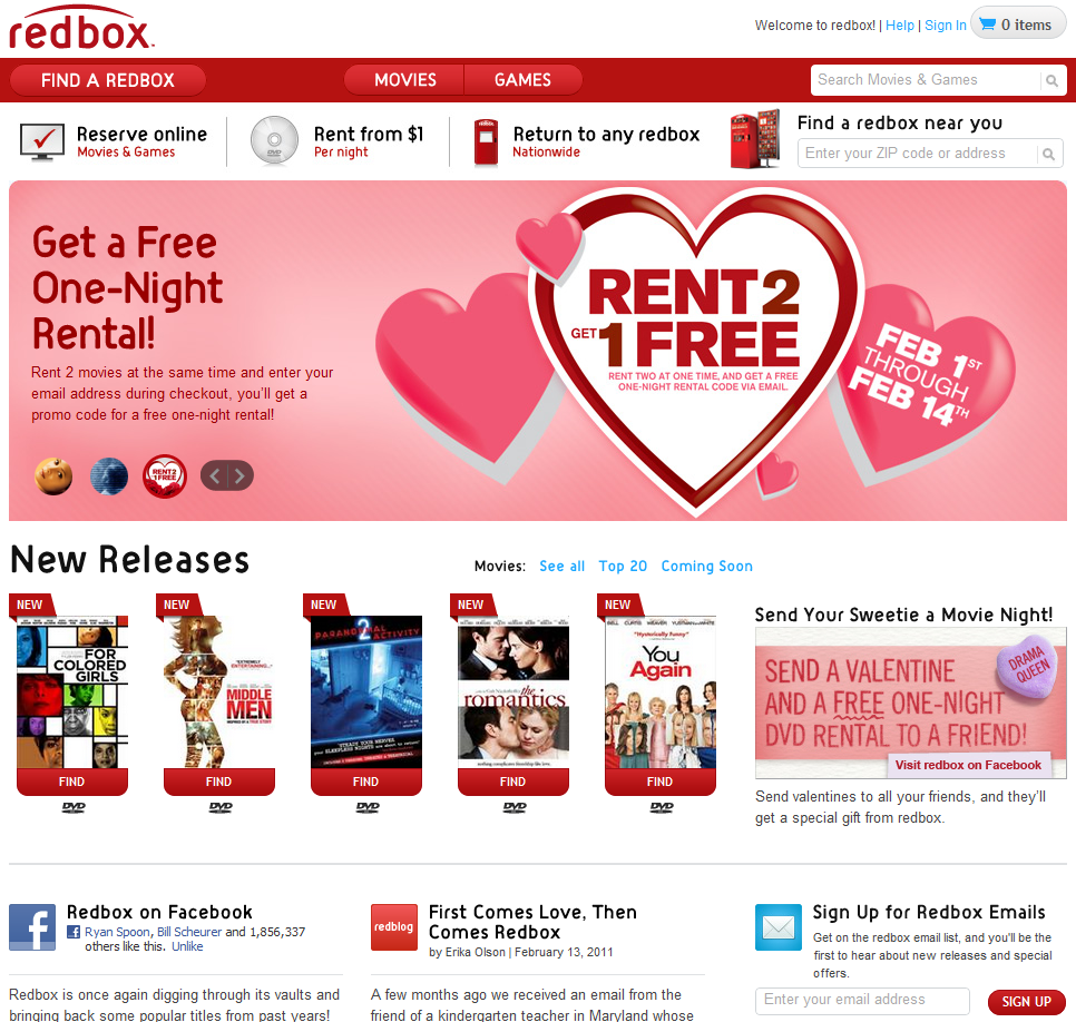
Unrelated: they also do a great job with their website:

- crisp and good looking - four major actions: reserve, learn, find and research - big promotion for Facebook fanpage (1.9m fans!), their newsletter (per above) and the bog - easy-to-navigate list of available movies - with trailers and cast - the ability to send Redbox gifts (ie a Valentines rental via their Facebook app)

And Redbox.com:

Exclusivity And Facebook Fan Pages - Whats the Incentive?

Over the summer I wrote about the four keys to Facebook page marketing: authenticity, consistency, regularity and engagement. Particularly for those in the e-commerce space... and for those trying to tackle "social shopping"... there is a fifth: exclusivity.

I am not sure that 'exclusivity' is the best word, but the point is twofold:

1. Why should I become a fan? as you think about 'acquiring' fans - what is the incentive? 2. How do you drive engagement?

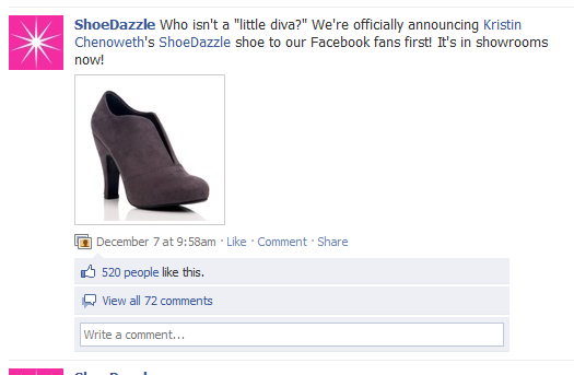
Exclusivity is the key to both. Portfolio company ShoeDazzle is terrific at this: their 500,000+ Facebook fans get special insights, contests, and behind the scenes access.

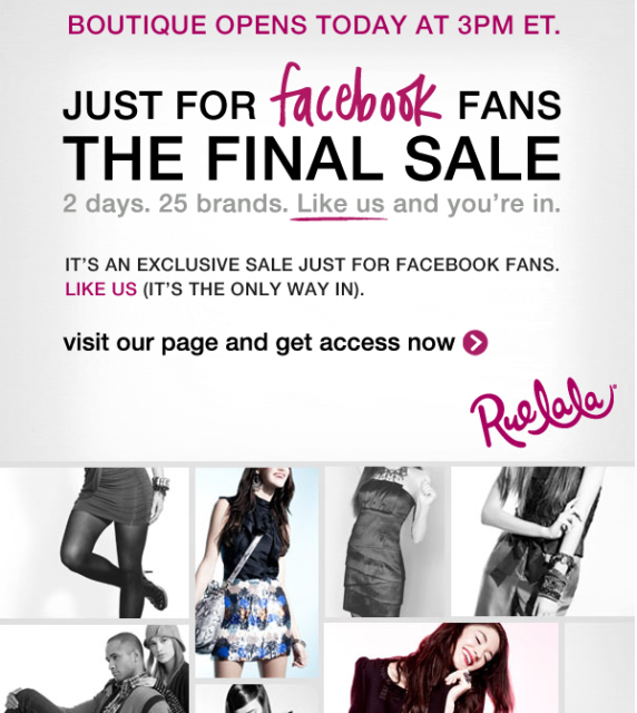
I was reminded of this by an email from Rue La La today... who are selling exclusive products today only to Facebook fans:

Gilt Groupe Gives Free Shipping for 10 Invites

Social commerce sites like Gilt, Rue La La, ShoeDazzle, Groupon and LivingSocial have been among the leaders in 'social marketing'... and they find success through relatively straightforward, sometimes simple products and promotions. Here is a great example: Gilt is running a promotion where users who invite 10 friends to the service get free shipping. Clear value proposition and very simple process to invite. Furthermore, it is an attainable result (not tied to purchases and not a crazy number of invites).

And of course the site / brand itself is 'share-worthy' - if Gilt provided a poor experience, these sorts of promotions wouldn't result in sharing or ROI.

"Got 10 Friends? Get Free Shipping" "Invite 10 friends to Gilt and enjoy free shipping on your next order. Spreading the word is always in style."

Optimizing Call to Action Buttons

Smashing Magazine has a terrific guide to designing "call to action buttons." Design and optimization can increase conversions dramatically - just ask (and study!) these conversion-focused leaders: - Social gaming: RockYou, Slide, Zynga, etc - Flash Sales: Gilt Group, Rue La La - Couponing: Groupon, LivingSocial Smashing Magazine lists dozens of examples. I boil it down to the following:

- size and location: think of visiting a grocery store and what catches your eye in the aisle - color and 'clickability': does the button stand out? does it change on hover? - call to action and copy: what are you asking users to do? is it tempting? This dictates size and location...

With so many variables, the only way to optimize is thorough A/B testing. Cycle through messaging, placement, size... collect data and optimize upon that.

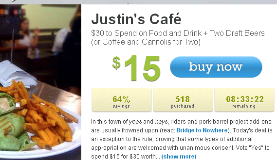
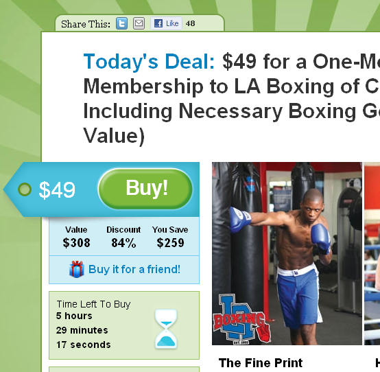
Looking for inspiration? Visit the companies listed above: they are industry leaders in funnel and conversion optimization. Here are two examples from LivingSocial & Groupon. Notice how each call to action has large & colorful buttons, clear messaging and conveys urgency:

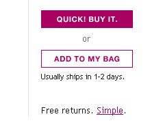
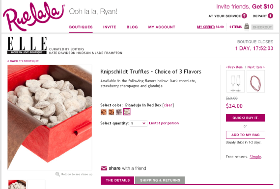
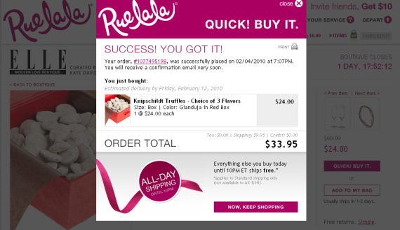
Rue La La's "Quick! Buy It." Button Enables Instant, Simple Purchases

In an effort to expedite checkout and prevent shopping cart abandonment, retailers like Amazon have pushed "One Click" purchasing and recently introduced "Amazon PayPhrase". That focus is even more important for time-sensitive e-commerce sites like Rue La La and Gilt Group - where the sale has limited inventory and time... such that a delay between "shopping cart" and "checkout" can lead to expired and empty inventory. To prevent this, Rue La La introduced the "Quick! Buy it." button... and it's terrific. See an item you like? Just click "Quick! Buy it." and it's your's in all of one click. Rue La La takes advantage of the:

- emotion: time sensitivity, buy-it-now, limited inventory; and - customer database: your billing and shipping information are on file - so one click is sufficient The result is instantaneous shopping that is easy and fun - which is what these deal / time-based shopping experiences are predicated on. It's yet another way for Rue La La to take advantage of the time sensitivity that they work so hard to ingrain in shoppers - between the limited inventory and the ticking clock, there is a pressure to purchase now... and the transaction speed (along with the language / branding - Quick!) reinforce the behavior.

Rue La la's "Quick! Buy it." Button

Each item has two options: Quick Buy or Add to Cart

One click - it's that easy

Google Nexus One Unboxing: Great Packaging and Branding

I have spent a lot of time thinking about packaging - particularly over the holidays as we all purchase and receive gifts. Companies like Amazon focus on speed and reliability while others like Rue La La put a lot of care into visuals, emotion and even virality (future post coming). As pictures and reviews of the forthcoming Google Nexus One make their way online, I was struck by the care and uniqueness of the packaging and branding by Google / Android. It is clever and powerful. It is also a stark contrast to the blunt and robotic messaging of Droid: - Droid is here: compromise officially deactivated. (ad here) - Jump from page to page like a caffeinated cricket in a room full of hungry lizards. (ad here)

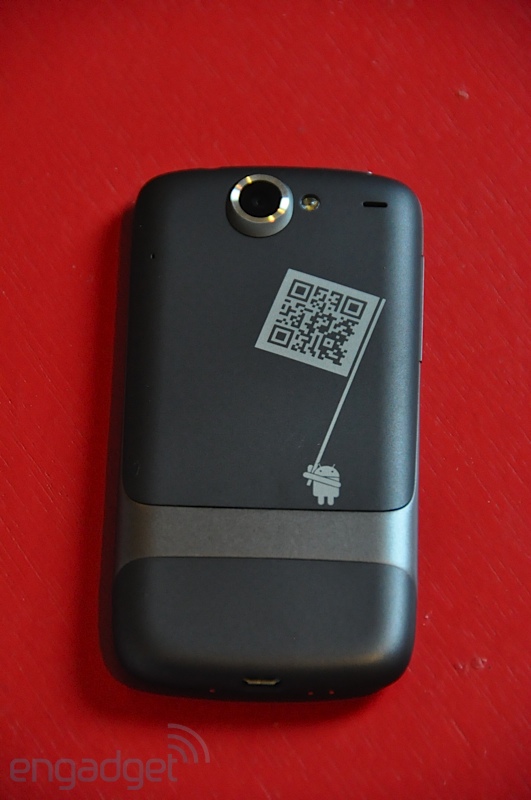
Meanwhile, the Nexus One packaging oozes Google's brand and is more fun than rigid / tough (like the Droid). From the 'get started' pamphlet to the start screen to the phone's casing, it is obvious that this is: - a Google phone - an Android device - is equipped with 10,000s of applications - has character and funkiness Engadget has a great review and photo gallery of the Nexus One. Here are a handful that highlight the above points and check out all of the photos on Engadget: