Doodle Jump's iPhone App Warns: "Insanely Addictive"

Most iPhone apps do not come with warnings - but Doodle Jump, the #2 paid application by Lima Sky, has built an advertising campaign around the addictive gameplay: Be warned: this game is insanely addictive!" The ad unit then cycles through anonymous iTunes reviews that highlight just how addictive the game is. Once clicked, the ads take you directly into iTunes so that you can download Doodle Jump for $0.99 and spend hours draining your iPhone's battery!

Zendough's Rich Ad Campaign Hits Gizmodo

Gizmodo continues to be a great example of cutting-edge rich advertising units. As I have written before, they do a great job of laying out the site in a way that gives advertisers large, interactive and cohesive advertising units across all of the content; furthermore, the units do a great job of interacting with the standard Gizmodo content (sitting beside and/or fading behind).

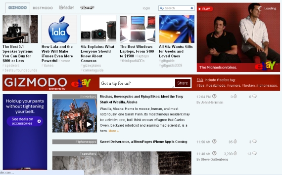
Here is another example of a rich campaign on Gizmodo. Much like the recent eBay "Come to Think of It" campaign, this comes from Zendough. The ads begin by taking over the "top stories" bar and then fade into the traditional Gizmodo layout (as the person walks across the screen). On the page, Zendough has five integrated units:

- the interactive "top stories" bar that fades out - the rich square in the upper right corner - the sponsored search bar - the rich skyscraper which parallels the activity above - the rich horizontal 'page-break' unit which is 8 stores down Clearly it is a custom campaign - much like the eBay one - but it is very nicely integrated within the Gizmodo layout and amongst itself: all of the units symmetrically speak to one another and therefore gently capture the audience's attention / interest.

eBay's "Come to Think of It" Campaign Arrives on Gizmodo

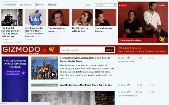
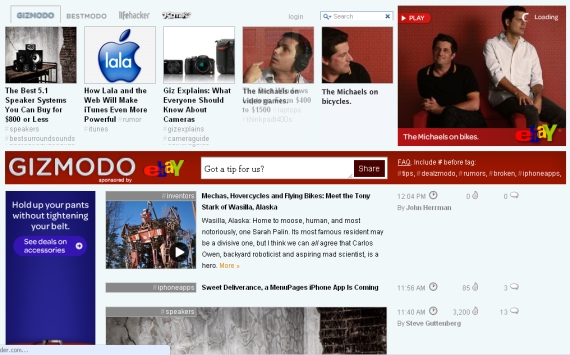
eBay's "Come to Think of It" advertising campaign is all over television... and is now making its way across the internet as well. The below screenshots are of a matching campaign on Gizmodo. The ad units feature the stars from the TV spots ("The Michaels") and the color scheme is very much eBay (which is quite bold on the Gizmodo layout). The interesting part about the ad units is its interaction with Gizmodo's standard navigation pane and content. The ad begins across the top of the page and then fades to reveal each of the 'featured' story tiles. It draws the eye to both the eBay units (including the bigger 300x300 unit) and it brings attention to the 'story' tiles (which is also in Gizmodo's benefit).

ebay gizmodo 2 ebay gizmodo 1

ebay gizmodo final

Wendy's Real Time: An Interactive, Social Ad Campaign About Bacon

Wendy's has been advertising their new Bacon Deluxe burger which features four strips of Applewood bacon: wendys bacon deluxe

So unless you love bacon, why is this interesting? Because Wendy's has been promoting the burger heavily in an interactive campaign that runs on prominent websites like ESPN and Gizmodo - and concurrent to a large television campaign... and that the campaign is billed as "Wendy's Real Time" - a play on the real time web and their focus on "real burger" taste.

The takeaway (which I moved up from the bottom of the post) is that this is a unique and interesting swing at real time advertising / branding... but it is too dynamic and too big. The interactions and user experience would be greatly simplified if they integrated with Twitter's OAuth and also with Facebook Connect. Why ask people to leave Wendys.com to post, interact, etc. Make it simple up front and then push the data both directions: on Wendys.com and on Twitter / Facebook (both of which have clear benefits).

Below is a screenshot of an expansion leaderboard ad that features the burger and invites you to "view Wendy's real time":
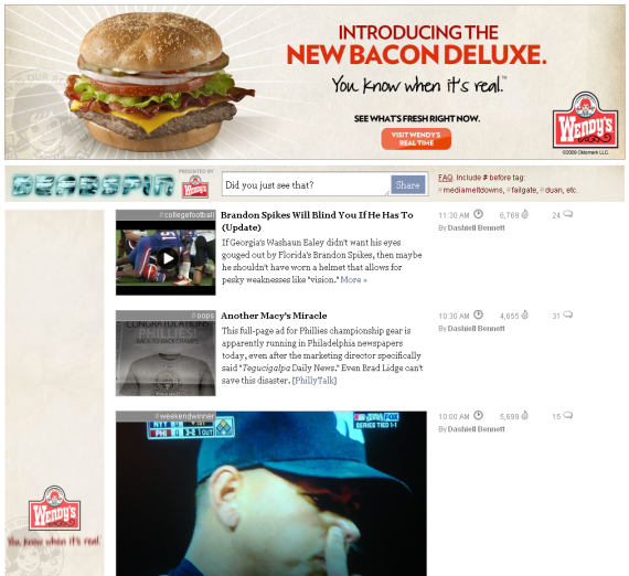
Wendys Real Time Leaderboard expansion ad

The leaderboard retracts into a traditional size, but it is also matched by a skyscraper with similar messaging:
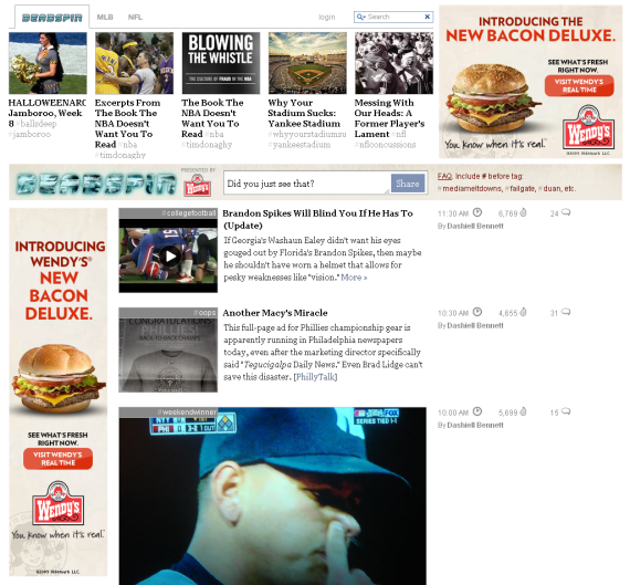
Wendys Real Time Ad Units Real Time

The ad takes you to the "real time" experience - which is a mix of Twitter updates, user photos and videos, Wendy's messaging, etc. It is cooler than it is effective (or even decipherable) - content is dynamic and constantly moving, but much of it is neither about Wendy's nor bacon.
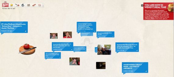
Wendys Real Time Overview

When you click on a post, it expands the Twitter message and displays the user's Twitter information (allowing you to follow him / her).
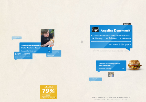
Wendys Real Time Twitter User

The video experience is easier to digest and the incentives for posting are more clear: hamburgers for a year. By posting videos of your Wendy's experience, you are eligible for the contest. The UI is slick and this content clearly be reusable for other campaigns (such as on Facebook).

Wendys Real Time Video COntest

Finally, Wendy's encourages you to Talk Bacon with their Twitter account (@urBaconMeCrazy).

Wendys Lets Talk Bacon