Jetsetter Navigation Panel - More UI and Design from Jetsetter.
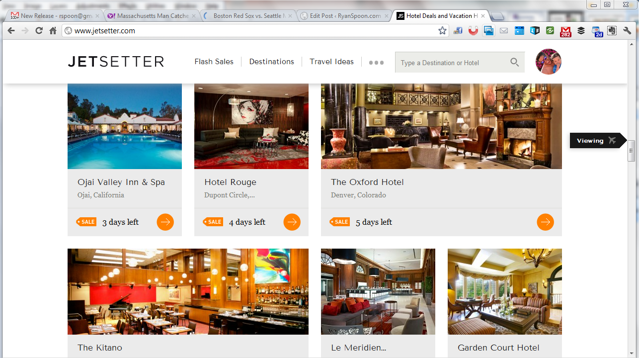
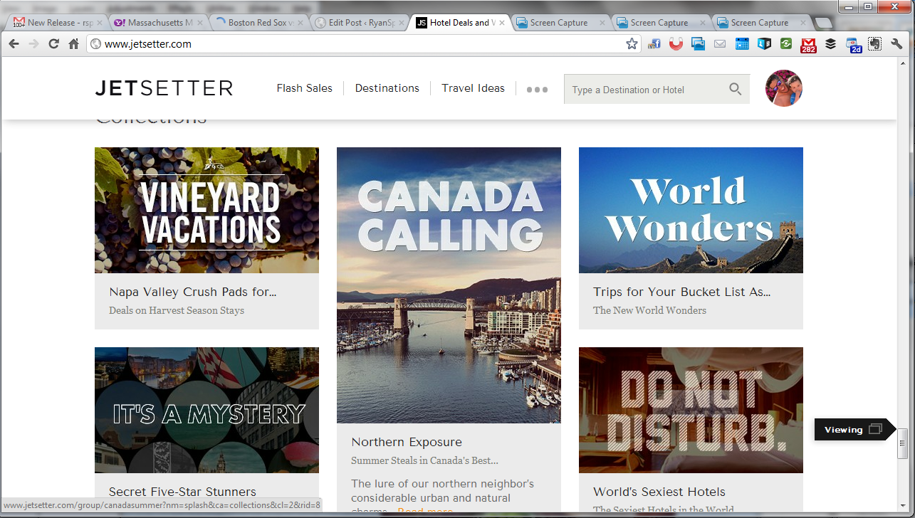
Jetsetter is known for great design (see here) and here is a nice little UI treatment that we recently saw on The Verge (who uses it on mobile and web). As you scroll through Jetsetter's sale page, an icon scrolls alongside the right progress column. It serves two functions: 1. telling users what kind of content they are viewing, ie vacations or curated lists. 2. showcasing the depth of product / offering that Jetsetter offers. In other words: there's a lot more than what I've seen!
Jetsetter Mobile App: Effective App Promotion & Conversions
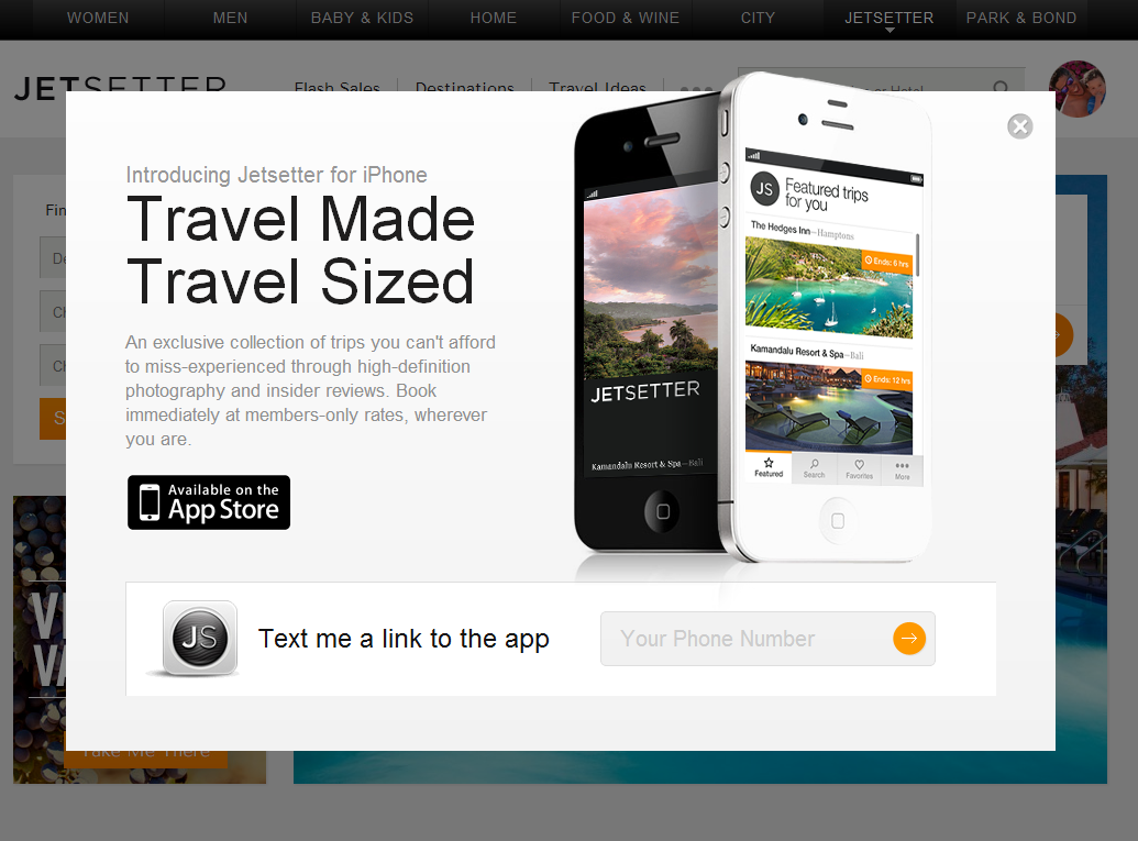
Jetsetter is known for great design (see here). Here is a good example of good design and effective mobile promotion. I have written before that promoting mobile applications via the web is challenging: for instance, conversions are weak due to web to download and data is limited (device, OS, etc). SMS and email are powerful ways to promote applications because they are consumed directly on the device. Good examples by: Sparrow, Redbox, Groupon and Gilt.
Here is another good example by Jetsetter (whose parent is Gilt). Login and you get the following promotion: - awesome slogan: "travel made, travel sized" - good looking promotion - big action item of downloading the app via SMS (enter your cell number)
Much cleaner for users and more powerful for the brand.
Google Chrome for iOS: Two Unique, Nice UI Treatments
With the launch of Google Chrome for iOS, I committed to swapping out my iPhone and iPad's Safari browser (of course I can only do this on the dock - Safari cannot be replaced as the browser from core applications like email, etc). I did this in part because: 1. I wanted to try Chrome (as compared to Safari) 2. I was drawn to the Google account syncing and UI enhancements 3. I wanted to understand whether a browser shift is really doable (considering Safari integration, habit, etc)... no matter how great Chrome may or may not be.
The attraction to chrome is it's gloss: it's really a beautiful product and interface. Two small examples I wanted to highlight:
1. When you open the browser, it inherits the last-opened page and renders it in black & white while the page refreshes. I have no idea why I find this is great... but I really do. It's more 'cool' and good-looking that useful - but it there is a benefit to it: it shows that the page is out of date and reloading.
2. For whatever reason, most iOS applications (both by Apple and third parties) use horizontal sorting - in other words, you navigate by moving right or left (ala the homepage). Google Chrome's 'tabs' concepts moves vertically. Pages layer atop one another and you drag through them to access other open tabs. Based on the speed and touch, it either scrolls or highlights a particular tab. It's a very natural way to sort and is also good looking.
Scale Requires Curation, Apple Beginning to Address in iTunes & App Store with iOS 6
I have been sitting on this post for weeks and weeks: I tend to write posts, or the skeleton of posts, ahead of time and publish them later on. In some cases enough time passes - or enough happens and changes - that it makes those posts irrelevant. This one is pretty close. I had the below screenshot surrounded by blurbs outlining three primary points: 1. We all talk about curation as the balance to search in finding. Apple does a good job with it in Movies and in app themes (Fitness: Get in Shape below). This experience is far better than searching a basic category. And they do a better job with it in Movies (actors, categories, etc).
2. Curation of some sort is necessary as content scales. Findability was a constant focus for eBay and for anyone with great inventory: Apple, iTunes, Netflix, Amazon, etc. It is probably best as a balance of editorial and algorithmic curation.
3. Curation is powerful by Apple. But it doesn't scale. Curation by friends (hello Facebook, data!) is arguably more powerful and does indeed scale.
This of course is all rather out of date (good!) with Apple's WWDC and iOS 6 announcement on Monday. Coming in iOS 6 are Facebook recommendations to the app store (terrific news - years late, but great... and it looks similar to Facebook's own App Store effort). Furthermore, they are remodeling the Appe Store, iTunes and the iBookstore. Those mock ups (small one below) look like a great effort will be placed on visuals, findability and some form of curation (again: algorithmic + editorial).
From Apple's iOS 6 intro page:

Apple's Gorgeous iOS 6 Product Page.
So much has already been written about Apple's WWDC and their iOS 6 announcement... and I too will pile on a couple short (and late) reactions. This one really has nothing to do with the hardware or the software... but rather the store page Apple created to showcase iOS 6. I tweeted about it last night:

Having reflected a little more on it - and the many discussions I have had over great product / merchandising pages (from eBay to portfolio to here on the blog) - I think it is worth showcasing this page once more.
A couple quick notes, which will essentially just expand on my 100 character tweet:
1. The page is entirely on-brand for Apple. Familiar.
2. It's a single page. Yet it is very easy to navigate. The icons atop the page move you throughout.
3. It is content heavy... but you wouldn't know it. Secondary elements are tucked away within each feature - for instance, the Facebook section has three sub-bullets which navigate horizontally - meanwhile, the core features navigate vertically.
4. It reads like a newspaper. The headlines are atop. The supporting content is ordered by importance. And the tertiary content (smaller features, developer kits, compatibility) are tucked at the bottom and formatted differently.
5. It's visual. Great looking and easy to consume.
And it's applicable beyond products. This page (it's layout, characteristics, etc) is relevant for merchandise (ie physical product), services (ie subscriptions, SaaS), about-us (ie informational content) and beyond.

Two Small Features of Facebook's Camera iPhone App
Over the last week, I have been using the Facebook Camera application as my default mobile camera - in part as a test and in part because I love the ability to upload multiple pictures / create albums (that feature alone is a time saver). Here are two small features I like and noticed... and note: this is my last Facebook Camera post!:
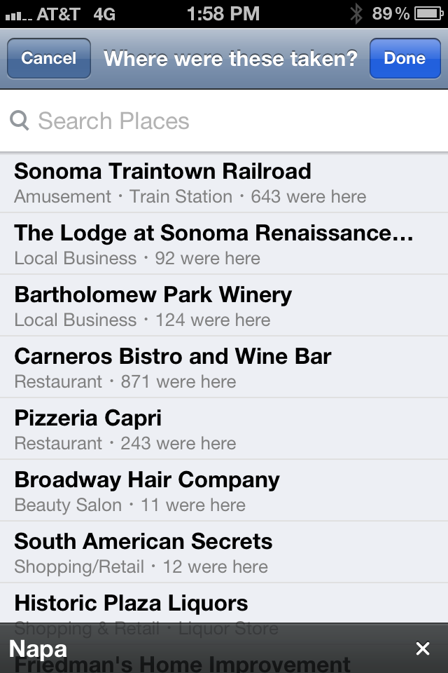
1. When you upload an album, Facebook inherits the location from the iPhone geo-tag. Seems like a small and relatively obvious aspect - but it is strangely not done by other photo-heavy apps like Path. And it is particularly useful when uploading albums - which often happens after the event and therefore offsite. As an example, the below screenshot remembers the location of the photos (even when I am physically away) - in the core Facebook App, location is determined by proximity - meaning that tagging has to happen when on / near premise.
Big time-saver. Very smart.
2. When you like a photo from within the app, Facebook illuminates the like button and gives it color. It's the first time I've seen Facebook do this and, although it is a very small UI tweak, it signifies that an interaction has been done (a current problem for Facebook's core mobile app) and it adds some color & some fun.

Facebook Camera iOS App Knows Who You Are On Install
Two weeks ago, Facebook launched their Facebook Pages iOS app. And last week, Facebook launched their Facebook Camera app.
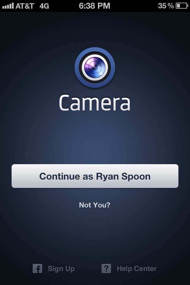
One of the interesting aspects of the two applications is that their welcome screens greet you with the following pages: blue screen, big get started button, and (in the Facebook Camera example) a greeting specifically for me ("Continue as Ryan Spoon").
 |
 |
The Pages example is easy to explain: press "log in" and Facebook authenticates the user via the core Facebook Application already installed on the device. Easy. And of course an user of the Pages app will already have the Facebook app... it's easy to be presumptuous when you have Facebook's reach / scale.
The Camera app is more interesting - and the first time I have seen an example like this. It is also something only someone like Facebook can do (few others have that reach). It is remarkably fast, efficient, cool.... and effective - no worry about conversions, funnels, etc.
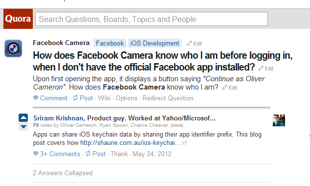
How do they do it? Here's a Quora post explaining:
Amazon's New, Expanding Navigational Menu
I have covered Amazon's navigational menus before (here, here, here and here). This is yet another update to Amazon's navigational menu: The Shop by Department still exists - and is still ordered the same way (preferencing digital over physical). But instead of being simple links, everything expands on the hover to showcase different product & merchandise depending on the category. Below you see two examples: Kindle (which highlights each model and Kindle related products / services) and Cloud Drive (which is a large promotion).
The plus is that there is more real estate and opportunity to merchandise and promote (for instance, the Cloud Drive unit is far more interesting and explanatory than a hyperlink). The negative is that this is a heavy series of interactions and can be a slow user experience.
Amazon is the king of conversions and monitoring pixels... interesting to watch what happens with this experiment.
