Facebook Deal Redemption in the Feed: Gap & Starbucks

Last week I wrote about two updates to Facebook Places: Deals (using Starbucks as an example) and Photo attachments. Those two somewhat combine when deals are redeemed. If you haven't seen an example yet: here is the feed post after the Starbucks deal is redeemed. It is an expanded check-in on the Facebook feed... which means two primary things: 1. the post is customizable by the deal provider. Here, Starbucks has four pieces: logo, deal title, detailed description and viral call to action. In effect, this is great branding within the newsfeed ... that branding happens to be enhances by the fact that a friend is advocating it.

2. All the viral components associated with the feed: comments, shares, likes, etc. This is important because it is a core / necessary element to the deal platform - in a way that isn't entirely integrated on other popular sites which require post-transaction publishing.

And here is Gap's promotion:


Starbucks Already Advertises Against Facebook Places Offers

Today Facebook shook up the local deals space with their Facebook Places announcement: the local deal platform which now competes directly with Foursquare, Yelp, Groupon, etc. Facebook launched with twenty premier partners who represented different industries (Gap :: retail; Palms :: hotel; Starbucks : food; Golden State Warriors :: sports; etc). The platform will quickly expand to 20,000 local businesses and then a self-serve platform. Considering Facebook's size, mobile usage and collection of brands / business owners - this is a big deal.

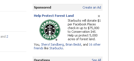
... And Starbucks seems to recognize that. Immediately after the Facebook announcement, they began advertising with premium Facebook ads - specifically promoting their places offer: "Starbucks will donate $1 per Facebook Places check-in up to $75,000 to Conservation Intl. Help us protect 5,000 acres of forest land."

Facebook Begins Promoting "Recent Checkins"

Facebook often uses their sidebar to promote other products and features:- Image labeling - The friend finder tool - Facebook job openings ... etc Today was the first time I spotted integration of Facebook Places - specifically with "recent checkins". The unit shows checkins by your Facebook friends with timestamps and links to the locations / hubs.

I personally hope that this is the beginning of a larger location feed / map... interestingly you will notice that there is not a 'see more' link. Hopefully that is to come.

Facebook Rolling Out Commenting System

Earlier today, Facebook announced their Bing integration and the post on Facebook included a new Facebook commenting system. TechCrunch has since covered and confirmed that a larger commenting upgrade / system is coming.

A couple very quick thoughts:

1. It is a no-brainer that Facebook would apply their graph to commenting... it fits nicely alongside the like button (which also includes expanding comments).

2. It is a no-brainer that Facebook will gain distribution rather quickly since: A. The integration should be relatively simple (as the Like button is) B. It could tie-in very nicely to the already-existing FB widgets, buttons, etc C. It could drive significant traffic to the publishers via on-Facebook promotion

3. It again represents Facebook's ability to build social search. Prior thoughts here.

4. It potentially represents a rethinking of on-Facebook commenting / threading as well.

I will try to have Facebook comments live on RyanSpoon.com once available.

The Impact of Facebook on Image Presentation?

Facebook has quickly become the largest sharing and storage platform for photos. It is in part because of the social desire to share, part because of the newsfeed and part because of the simple mobile integration. The below screenshots should look familiar. First is a newsfeed preview of a photo gallery and below is a gallery's homepage. Both layouts are tiled and offer very little content / description (only available after the click or within comments):

The phenomenon of big, colorful tiles as a navigational system isn't new... but it certainly is more prevalent and seems to be popularized by services like Facebook. Here are a few more examples of different types. Remember that for each of these, the prior convention was typically top-to-bottom content / navigation:

- For content (news, blogs, etc) the mainstays focus on title / text and often move north / south - For e-commerce, Amazon, eBay, etc move north/south (though are experimenting with new formats like the iPad)

Navigation

Here is Facebook's new navigation panel for Facebook Pages. Notice that it is entirely visual - there is no text or context (ie number of fans, description, etc)

Content Site

This is popular blog Good.is and, below that, a popular personal site HugsforMonsters.com. More and more blogging templates are moving this direction and it certainly redefines how you think about navigation on content sites.

E-commerce

Neither imagery nor horizontal browsing are new to e-commerce. But the trend seems to be larger, more interactive images with the content (description, ratings, etc) reserved for the product details page

Twitter's Surprising iPhone App UI

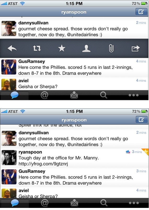
Not previously known as a leading designer, Twitter has been on a roll with their latest iPhone app, iPad app, and New Twitter. Here is a good example of why - but with some learnings / advice on how to design features. Twitter has to accommodate for lots of functionality: reply, retweet, search, favorite, quote, etc. You can easily imagine an application overwhelmed with buttons. Twitter solves this by having the core functions available via footer buttons, a "more" ('...') button and a surprising single tweet pane.

I call it surprising because it was not clear to me that this functionality existed... but if you swipe a tweet to the right, a pane appears that allows for quick functions of that tweet: reply, retweet, favorite, email, user info, etc. It is super useful... but is also surprising because I only discovered it accidentally. And this is a complaint I hear a lot from products trying to solve numerous tasks (no matter how elegant the solution may be). A consequence of simplifying complexity is often having to hide functionality... and that itself can lead to confusion.

It is difficult to boil down layers of options into a simple interface. It is equally difficult to make the interface intuitive and the functionality easy to uncover. That's why it's an art!

One other note: I love the small interactions that Twitter layers in... in the second screenshot, notice the small star that appears is uncovered in the upper right corner. That appears when a tweet is favorited.

ESPN's Persistent Score Panel... Very App-like

There's lots of innovation currently around persistant headers, footers, and bars. I wrote about Quora's notification 'panel' last week. You can also check out Apture (which I had been testing), Meebo, Wibya, etc. As with Quora, the 'bar' phenomenon is making its way to the publisher side. And it is being used creatively to deliver key news (ie Quora :: notifications), navigational flows, or promotional content.

Here is another good example.

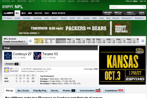
Months ago, ESPN introduced an interactive score panel (almost like the sports ticker that sits persistently on ESPN's TV channels). When browsing content within in a particular sport / league, ESPN now has the that panel lock atop the screen to provide persistent live scoring. The UI is very slick as the bar is glossy, animates nicely and maneuvers down the pages seamlessly.

Expect to see more and more of this around the web (and mobile). The experience itself is very much like mobile applications... and the web itself is starting to look and interact more like apps.

Here is the NFL score header on ESPN

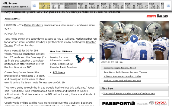
As you scroll down, the scores panel attaches itself atop the screen and follows

The Social Network Movies Advertising on Facebook with Myspace?

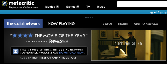
The Social Network movie opens today (Yes: I loved it) and advertisements are appearing across the web. That's not 'newsworthy'... but:

- The ad units themselves look a great deal like Facebook (again: no shock) - And the main ad unit has an "Add to Friends" link (see below):

- when clicked, you arrive at The Social Network's website - ... which strangely lists MySpace, Twitter and Facebook sharing buttons in that order (shouldn't it be Facebook first? perhaps only?)

- If you click the Facebook share button, a lightbox appears to post a MySpace profile announcement for the movie on your Facebook page. And what is with the suggested creative?

Very bizarre... and for a movie dedicated entirely to Facebook - and marketing to Facebook users / fans - you would think this would be better thought through.

Gilt City's Cleverly Designed iPhone App

Gilt Group has rolled out their new group-buying / coupon site Gilt City to six cities (New York, Boston, Los Angeles, San Francisco, Miami and Chicago). With it comes the Gilt City iPhone app. There isn't much to write about about the couponing model as it is very much like others in the space (see Groupon, LivingSocial, Yelp, etc). Over time, we will tell if Gilt Group is able to win share through unique offerings, integration with Gilt Group, etc.

I did want to quickly touch on the application's design... which as you would expect with Gilt Group, is glossy and very visual. The background of each city page is themed respectively. Below, for instance, is Gilt City San Francisco - which has a vivid picture of San Francisco scenery. Big, splashy images are becoming very popular (see my post on About.me) - and, with a relatively straight-forward product offering, it is one way to stand out, localize the experience and stay on Gilt's brand.

And with the emergence of big screen devices like the iPad, it is again a reminder that design and color are play an important role in the experience: