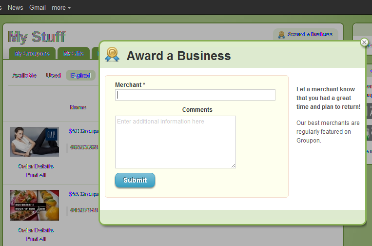
How does Groupon address concerns of loyalty / merchant retention? Build tools directly into the product that allow customers to communicate directly with the merchants. It's an easy, smart way to connect buyers with sellers - without interrupting either flow.
The experience (from the language to the graphics) is very positive ("Award a Business"). I am not entirely sure what the award is... and I am not entirely sure what is done with this content... but I applaud Groupon making an effort to address concerns and I always like tools that better connect both sides of the marketplace.
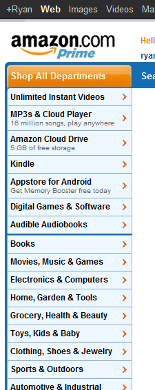
Amazon Navigation Menu Features Dynamic Promotions
In addition to Amazon's navigation menu promoting its digital properties ahead of the core business... notice anything interesting? It features dynamic taglines for three of the core properties: - MP3s & Cloud Player: 16m available songs - Cloud Drive: 5gb of storage - Appstore for Android: the free application of the day
For Amazon - the smartest online merchandiser / promoter - it is clearly an intentional decision to promote only three categories: new, growing categories in highly competitive areas. Amazon could off course feature deals of the day in other categories - but by doing so, it crowds the menu and creates too much noise / distraction in the menu... perhaps most importantly, those core categories are already successful, sturdy and well-trafficked. This is not true for the music, cloud and app businesses.
As you think about navigation across your site / experience - this is an example of less being more and the impact a few pixels and a small tagline can make.
Borders Palo Alto Closing, Offers 60% Off $45 Blu Rays (Bargain!)
The downtown Palo Alto Borders is closing and the entire store is marked at 60-80% off. Everything is on sale - from the books to the bookshelves. I walked in with the intention of buying some cheap kids movies (Yo Gabba Gabba anyone?). And this is what I came across: endless amounts of way-over priced product. $45 for the GForce Blu Ray? Even at 60% off its markedly more expensive than either iTunes, Amazon, etc. And that doesn't include streaming options, Half.com, etc.
And perhaps that's why there's a store close out and an accelerating shift in mediums... Who would have possibly spent $45 on this?!
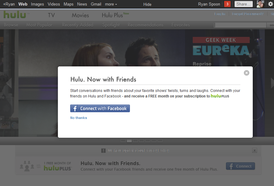
Hulu Gives Away a Month of Hulu Plus for Facebook Connect
After my rather public Netflix cancellation , I was lured into Hulu Prime with their Facebook Connect promotion: a free month of Hulu Prime if you connect your Hulu account to Facebook. Smart for Hulu because it's smart for me: - Hulu Prime is a better product with Facebook Connect. Browse is better. Recommendations are better. And it is more fun.
- The value of me being socially connected is absolutely worth a free month to Hulu. Again, better data and virally shared content.
- It is an instant reward (of decent value) for a instant social share (of greater value). The moment I start my account, it is shared on Facebook and that alerts my network that I am a Hulu Prime user and that I got a free month (so they should too).
- ... And the math obviously says that the cancellation rate must be far lower than the continuation rate.
Consequently, this is a better way for Hulu to run an introductory promotion (as compared to 25% or 1st month free) and it's a more compelling experience for me (even better for Hulu).
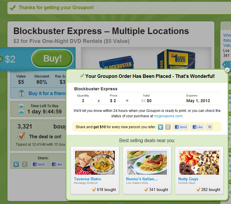
Groupon's Post Purchase Prompts. As "In the River" as it Gets.
Great example of "in the river" promotion by Groupon (one of the very best at conversions and promotions). It doesn't more "in the river" than the post-purchase screen... and it doesn't distract the user during the purchase / flow. This is an obvious example but worth showing because it's clean, clear and intentionally unavoidable. Immediately post purchase:
- the screen blooms into a popup with three components
- a lightweight receipt highlighting the coupon's expiration date (important)
- a chance for users to share their purchase and receive a $10 credit (Twitter, Email, Facebook, Facebook messages). I believe it's better to promote this post purchase because you can be more aggressive (even obnoxious) about it and not interrupt the conversion
- three more deals relevant to you (as determined by sales popularity and proximity)
Also worth noting: it is far easier to A/B test and optimize these flows than it is on the purchase / check-out page. Once you've optimized this flow, you can apply those findings elsewhere.
Facebook Deals Brings Friends Into Emails
I write a lot about Facebook Deals and I start each post with something along the lines of: I am not sure what Facebook Deals will become, but I give Facebook a lot of credit for the rate of innovation and their UI / UE treatments. Facebook Deals continues to test new visual treatments (examples here and here)... and here is yet another clever, compelling one.
Facebook's stance with Deals has been to overlay your social graph with your geography and your Facebook Places activity. They have done a good job merging those in the web experience... and here they do it via email. The first thing you see in the email is *not* the deal or the deal provider. It is the list of your friends (and their Facebook profile pictures) who have either liked the deal or the deal provider. Eventually it could of course be the friends who have visited the location, purchased the deal, etc (as we have seen in their online units
As your inbox gets more crowded -and marketers / brands fight for your time - this is a powerful way to capture your attention, improve conversion and tell a unique, differentiated story:
JetSetter's Search Box Promotion
I like the highlight examples of effective "in the river" marketing - the concept of placing product, promotion and marketing messages in relevant, active parts of the web experience. Lots of examples here... Here is another example from Gilt Group's JetSetter (which is one of the better designed and visually appealing websites).
The fundamental JetSetter experience is browsing really compelling, great-looking travel offers. Even with no intention of planning travel, I can waste dozens of clicks browsing JetSetter's delicious offers.
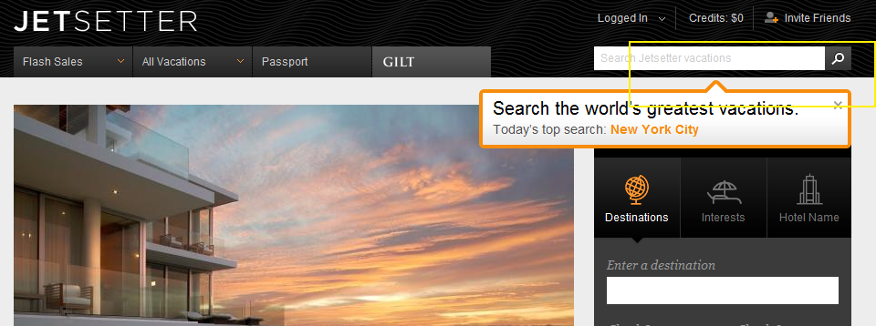
And while browse is JetSetter's primary experience, they are trying to drive search activity and have introduced both a search box and top searches. This is an obvious revelation because JetSetter overlays the message (along with today's top search) atop today's offer. It is bold, colorful and extends onto the offer and the right navigation pane. It also fades in (quickly and lightly) - in the rare case that you missed the unit.
On a side note: the "top searches" concept is interesting because it creates another browse + search experience that, in my opinion, is more shop-able. I believe that most significant travel (cost, distance, time) is *not* booked spontaneously... so the ability to search JetSetter deals for specific locations makes JetSetter more usable.... while still keeping the brand and web-experience in-tact.
Amazon's Navigation Bar Is Revealing
Have you looked at Amazon's core navigation pane recently... you know, where Amazon users start browsing through the online mega-store? ... It is fascinating. ... And it is revealing.
No longer are core categories like Books, Movies, Home, Toys, etc atop the page.
It is all about Amazon's Cloud services: - Instant Videos - MP3s & Cloud Player - Amazon Cloud Drive - Kindle (surprised this is #4 on the list!) - Android Appstore - Digital software - Audiobooks
I get that Amazon is pushing their new services and strategies... but it is a bold statement to put each of them ahead of the core experience (and where I spend 95-99% of my time / money).
Of course, for core products, homepage navigation is far less important than search and cross-product promotion. But it is a strong declaration of strategic focus.

Facebook Deals Continues to Get Interesting.
I have written a fair amount about Facebook Deals and why it is interesting & worth keeping an eye on.... and it's timely as Groupon nears its IPO and Google & Amazon begin to enter the space more aggressively. On a side note: I continue to believe that Google be a leader in the space. Android + NFC + merchant / buyer market share give them several leverage points. Facebook Deals is clearly a work in progress - and it's not clear what kind of priority it is internally. However, there are signs that it could be interesting and powerful. Here is yet another reason to believe so:
1. I received the following deal via email. Remember that deals are all about email... and Facebook has the largest, most engaged email list on the web.
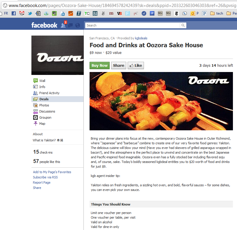
2. The deal directs me to the merchant's Facebook Page. This is really important. I am not being directed to Facebook.com/deals.... in fact, there is no link to get there. The integration between Pages & Deals takes advantage of:
A. the vast collection of merchants already on Facebook
B. further extends the importance of operating a Facebook Page
C. further extends the importance of driving Fans and rewarding engagement
D. connects Deals to Facebook Ads. Advertising on Facebook is more effective when it keeps users ON Facebook. This is yet another model for advertisers & merchants to make conversions work on Facebook.
